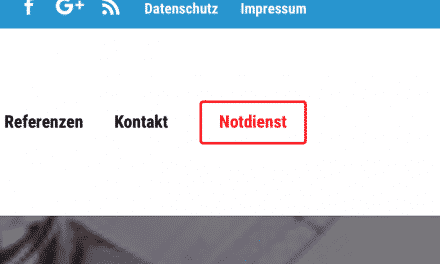
Es ist sehr ärgerlich, wenn man das mobile Menü anpassen möchte und dann Ergebnisse wie diese hierbei rauskommen:
Um Abhilfe zu schaffen, füge folgenden Code in den benutzerdefinierten Einstellungen ein:
ipad menu landscape
/* ipad menu landscape by www.divi-tutorial.de */
@media only screen and ( max-width:1100px ) {
#et_mobile_nav_menu { display:block !important; margin-bottom:20px; margin-top:6px }
#top-menu-nav { display:none; }
.et-fixed-header #et_mobile_nav_menu
{ margin-bottom:0; };
}